AppLariat Brand Refresh
AppLariat does an insane job helping enterprises speed up the process of taking apps to market. They’re IT gurus. So it’s no surprise their existing brand needed a little love. That’s where we come in…
Album was hired to completely refresh the appLariat brand. First, we simplified their overall brand strategy and positioning, and crafted unique brand values and messaging to resonate intellectually and emotionally with their target audience.
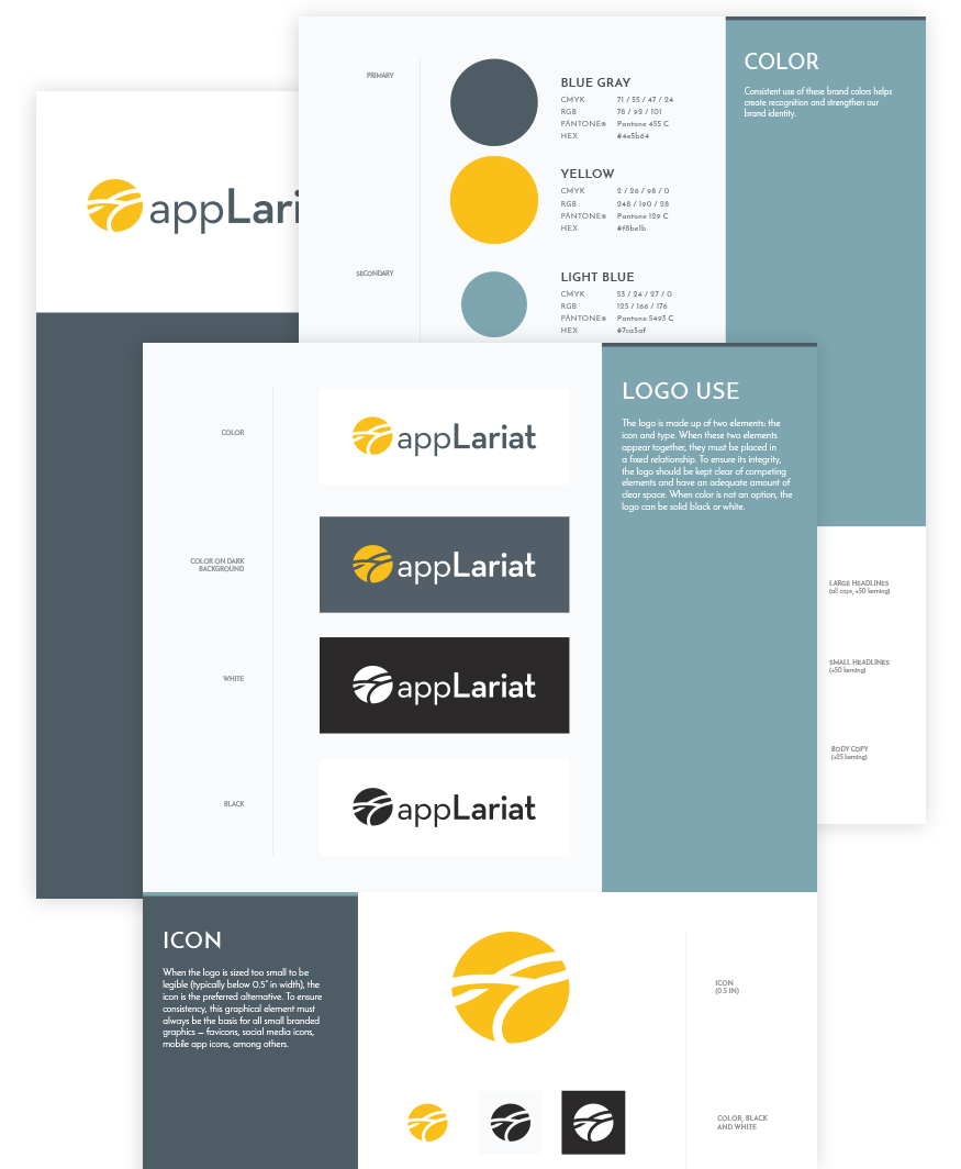
From there we designed a logo made up of two elements — an icon that symbolizes a lariat (a rope used as a lasso) in the shape of a letter “A”, and a light and bold sans-serif typeface to give it a clean, modern aesthetic.
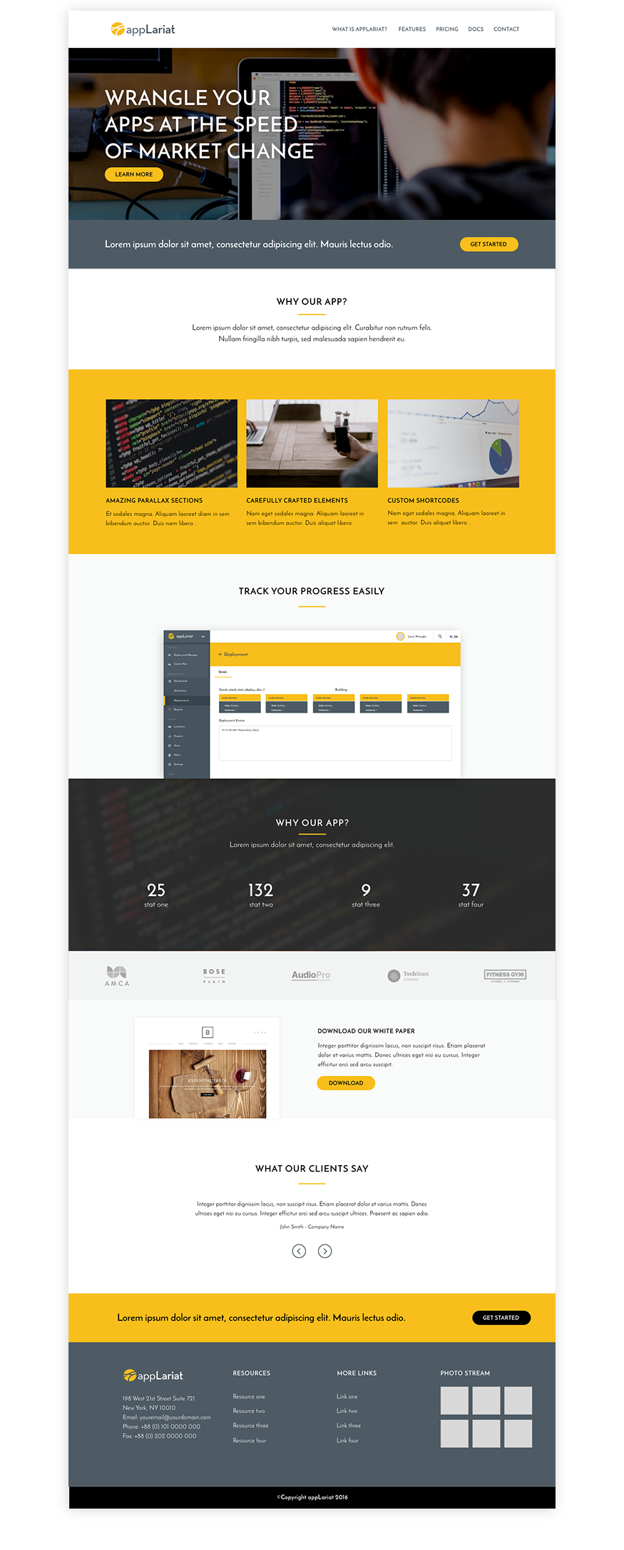
With a solid strategy and identity in place, we branded and simplified the app interface.