Big Brand Misconceptions
One of the biggest misconceptions shared among the general public is that logos of big brands like Apple and Nike just came to be. Since these brands are so deeply marked in everyday life, people assume these logos and brands were always like they are now, and that their meaning, power and top-of-mind spot was there all along.
Fact is, none of these brands started out as they are now, nor were as recognizable or famous. No brand is born in the final stage of accomplishment and recognition these brands have achieved. Both these brands have, in their 30+ years, invested loads of money to become what they are now. Their visual identity is ever evolving, as it should be.
The Evolution of a Brand
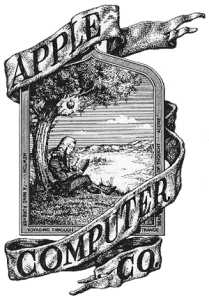
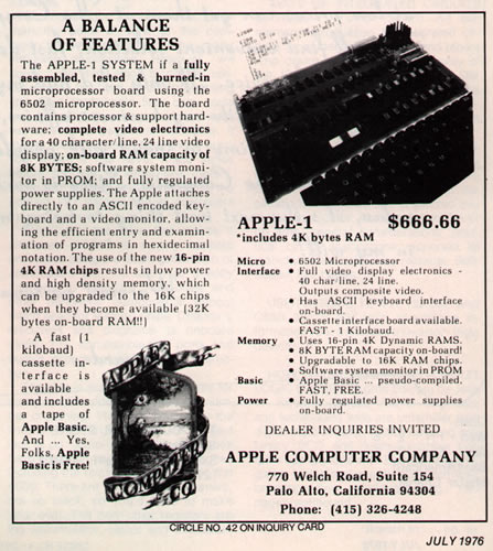
Prior to adopting the bitten Apple as its logo, Apple used a complex logo featuring Isaac Newton sitting below an apple tree (as seen to the left). The words APPLE COMPUTER CO. were drawn on a ribbon banner ornamenting the picture frame. The frame itself held a quotation from Wordsworth: “Newton…A Mind Forever Voyaging Through Strange Seas of Thought…Alone.” Apple’s first logo was designed by Steve Jobs and Ronald Wayne (two of the original founders).
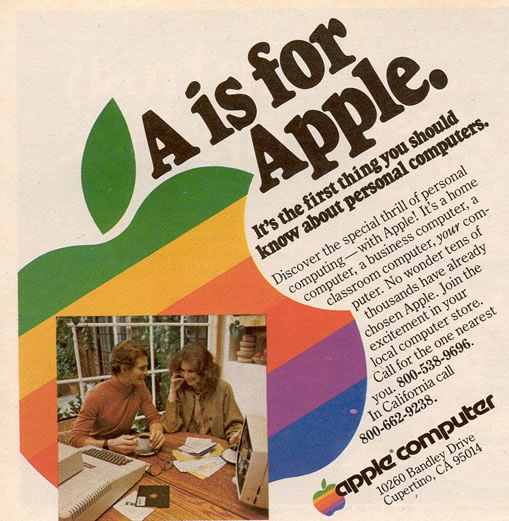
This didn’t last long and was replaced by Rob Janoff’s “rainbow Apple,” the now-familiar rainbow-colored silhouette of an apple with a bite taken out of it, possibly as a tribute to Isaac Newton’s discovery of gravity (the apple) and the separation of light by prisms (the rainbow colors). This was one of several designs Janoff presented to Jobs in 1976.
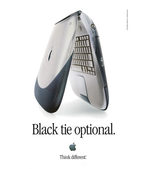
The rainbow version lasted up until 1998, with the roll out of the new iMac. Apple began the use of a monochromatic logo — supposedly at the insistence of a newly re-inaugurated Jobs — nearly identical in shape to its previous rainbow incarnation.
The (Type) Face of Apple
But not only has the Apple logo changed over the years, its type treatment — meaning the font and style that the name Apple Computer was written in — has changed dramatically over the years. Apple’s high-design culture has always been a top priority for Steve Jobs. Perhaps this is a result of calligraphy and typeface design classes that he took in college.
The first-bitten apple in 1977 had a very modern and techno-style font (Motter Tektura). Curiously, the original apple’s “bite” was designed to fit snugly with the Motter Tektura “a”. It later changed in 1984, with the introduction of the Macintosh, to a more narrow variation of the classic Garamond typeface. This typeface was virtually synonymous with Apple for almost two decades and formed a large part of Apple’s excellent brand recognition. It was not only used in conjunction with the logo, but also in manuals, ads, and labeling.
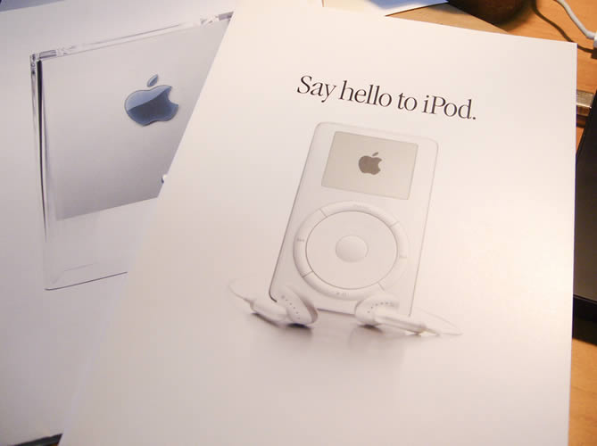
Even today the association continues; falsified images of rumored Apple products and spoof advertisements often use the Apple Garamond font despite the fact that it is no longer current. A little after introducing the iPod, Apple realized the Garamond font looked too classical for their new product line, so they changed from their famous brand serif font to a non-serif, more modern font called Myriad. Once again it was a variation of the original font (as you can see in the image on the right, there are some small differences in spacing and the letter “o” is a little more elongated).
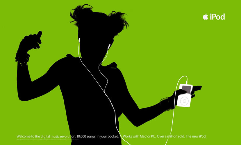
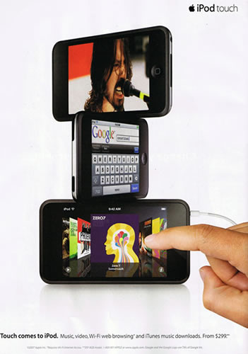
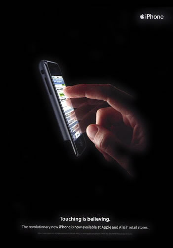
In the meantime, Apple continued developing a minimalistic approach to their ads and their packaging, reaching levels of complete abstraction, where no information is placed beside a product shot and logo. This goes perfectly with what the company sells, which is the design of their products and ease of use. This abstraction became Apple’s signature on every material produced by the company, with great use of white space and clean, uncluttered designs (just like their products).
This goes to show that even the smallest detail, even a typeface, can have a huge impact on one’s brand. From left to right is shown Apple’s original logo, Apple’s classical logo, and Apple’s newest logo – which is usually shown without “Apple” next to it. The name is shown here for demonstration purposes only. Notice, even, that Apple dropped computer from their name altogether.
Becoming a Big Brand
So what do big brands have in common and what can you take from this? These brands evolved over time, through marketing plans and lots of research and investment, to reach specific goals that they pre-established. Companies their size have well-defined brand style guides, to ensure their communication remains integrated. It’s this consistent repetition that builds brand recognition, equity and resonance.
Everyone wants their brand to grow and be distinguishable. We at Album Creative Studios love brands and love to see them grow. We have a very specific way of helping them; it’s called the Platinum Branding Process. There is no exact formula and every brand is unique, but the same rules apply to all. You must define your brand strategy first, then maintain a consistent message and identity. By following the guidelines set in place, your brand personality will remain true to its pre-determined goals. Then, it’s just a matter of time.
A simple demonstration of visual identity evolution through Apple’s ads in the last 30 years. Notice that in this timeline, the last ones do not even say Apple. They sign the ad with the product name and Apple’s logo, a sign of just how strong the Apple brand really is.
References
- Wikipedia: Apple Inc.
- Wikipedia: Typography of Apple Inc.
- Wikipedia: Apple Inc. Advertising


