Facebook Health Center Web Apps
Approaching the same old challenges in creative new ways
When our friends at Crossover Health landed a contract to run the on-site health center at the world’s largest social network, they knew they had an opportunity to revolutionize the way health care is delivered to patients. They turned to Album to help create an innovative and empowering experience for the thousands of employees working at Facebook’s Menlo Park headquarters.
Building on the brand identity and iconography created by Carl DeTorres, Album designed the user interface and developed the front-end for a series of web applications that all work together to bring the Facebook Health Center to a whole new level.
Building excitement for a revolution
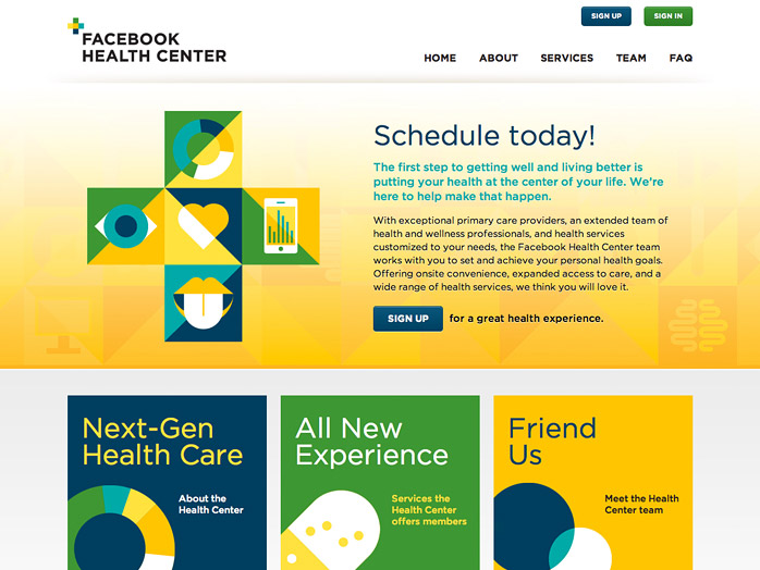
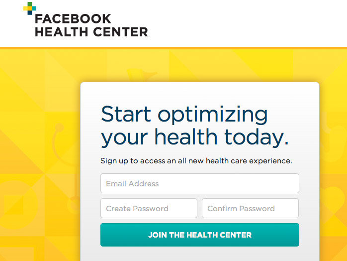
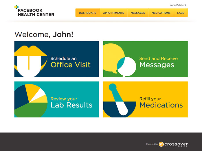
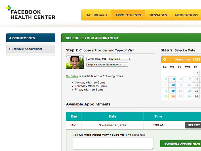
We started off with a microsite that introduces the new Health Center to employees and promotes the benefits of proactive health care. Next, we created an intuitive sign up process for Facebook’s workers to take advantage of the Health Center’s convenient online services. Finally, we built a personalized patient portal employees can access at any time to schedule office visits, private message their doctors, request prescription refills, review their lab results and more.
Embracing technology for a better experience
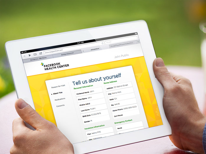
Our work didn’t stop there – Facebook also needed an enjoyable and cutting-edge experience for patients once they arrive for appointments at the Health Center. Utilizing the power of the iPad, Album created a paperless check-in process that patients won’t dread! With just a few taps, patients are taken though a step-by-step guide so they can explain their reason for visiting, update their contact and medical information, and provide other details that will help Health Center staff serve them better.
The Facebook Health Center officially launched just a couple weeks ago and so far they’ve received an overwhelming response from Facebook’s enthusiastic employees. Here at Album we’re already hard at work on more exciting things for Crossover and Facebook!
