It Hertz So Good
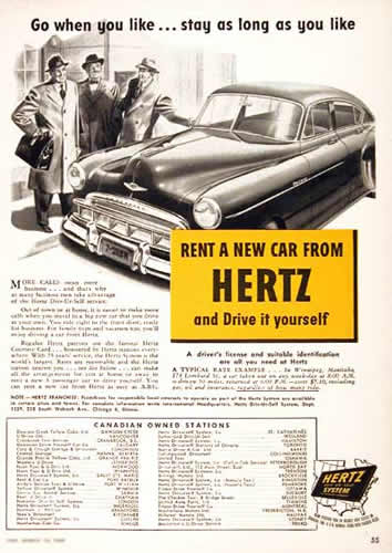
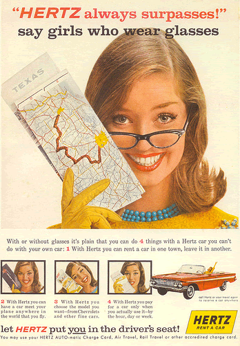
Hertz cast their shadow away and recently revealed a new brand identity. While the old blocky letters were bold and unequivocal, thankfully, the sunshine yellow is still shining strong. The new letters are a nice modern variation, with a rounder, friendlier feel. I think it’s a good move to bring them out of the 80’s, but not radical enough to lose all the brand equity they have racked up over the years. We’ll see if the public responds positively. They definitely have room for improvement. According to goodlogo.com, they rank 5.5 out of 10 based on 8000+ votes. From a branding standpoint, they’ve done a stellar job of retaining the yellow and black color palette. 50+ years to be precise…

1949 Hertz ad

Hertz ad from the 60’s


