A Wonderful Surprise at Album
In the midst of searching through different articles online to share with our fans/follower/clients, we are exposed to a wealth of information that we only hope to convey clearly to help you with different parts of online marketing.
One of our intern’s favorite new information sources is, you guessed it, a twitter feed, that has been linked to some of the most knowledgeable, interesting, and successful people around. Smashing Magazine has been one of those reliable pals that unknowingly has made lots of Album employees thrilled to be in this industry, over and over again. They have posted the Album site as an example for different educational categories, such as the Speaking Navigation category in the Design Trends for 2009 article.
Now, this is a big deal for us. We put our blood, sweat, and tears into our work, and what kind of an example would we be for potential clients if our own site wasn’t worthy of praise?
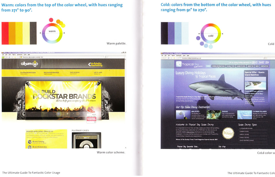
Well, apparently it is. So much so that when Smashing Magazine published The Smashing Book, they included us in it. That’s right! Here we are on page 170:
This is in the “The Ultimate Guide to Fantastic Color Usage in Web Design, Usability, and Experience” section.
All we can say is: Go Team!
Fun Fact: As you may have noticed, the article mentioned earlier was called “Design Trends for 2009.” The site was launched in 2008. What does this mean? We are ahead of our time when it comes to what’s cool, what’s hot, what works, and what just looks good.
Don’t mind us if we toot our own horn every once in a while.


