The Colony House Venue Branding
A rustic event space in Anaheim that feels like home.
That was the venue branding challenge: Create a contemporary brand identity that looks and acts modern, but feels like home. But it was hardly a challenge, with such a beautifully designed facility. Our job was to position the brand to drive leads and complement the existing Craftsman-style ambiance.
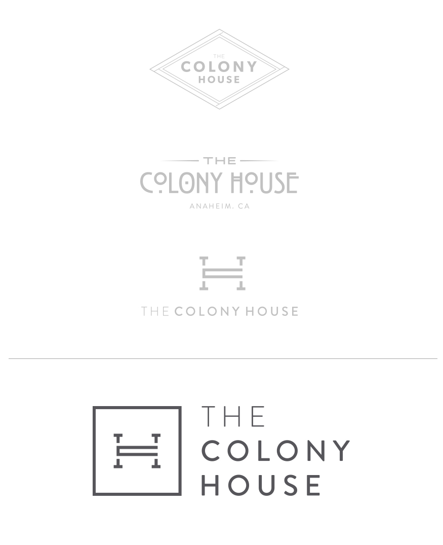
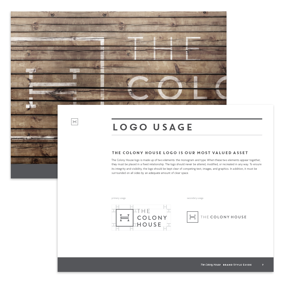
As usual in our strategic branding process, the brand positioning came first. With a clear strategy for the brand, the next step was logo and identity design:
VENUE BRANDING IN THE HOUSE
We landed on a contemporary mark with an initial focus on the “H” in house, but pieced together with a “C” for Colony and smaller “T’s”. The color palette is earthy and muted, emphasizing warmth and comfort with a modern twist.

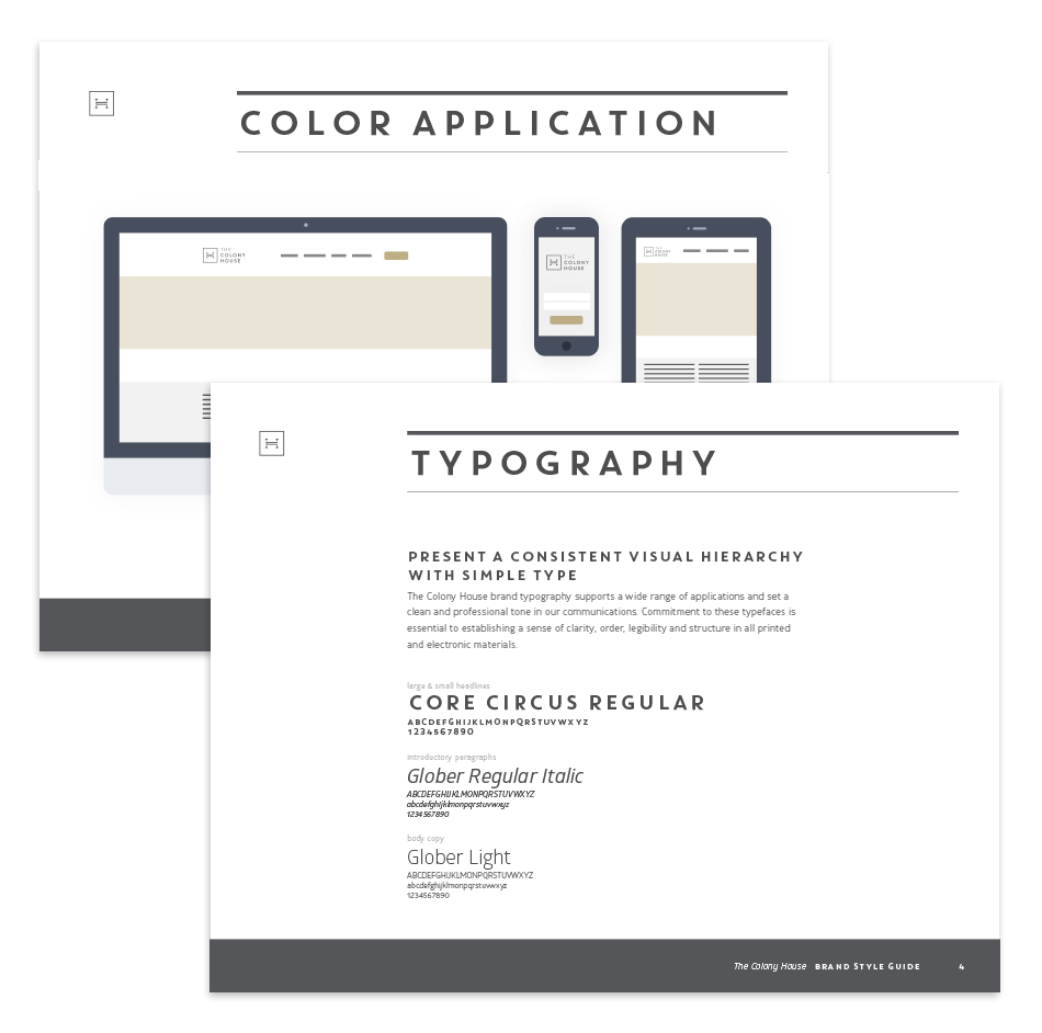
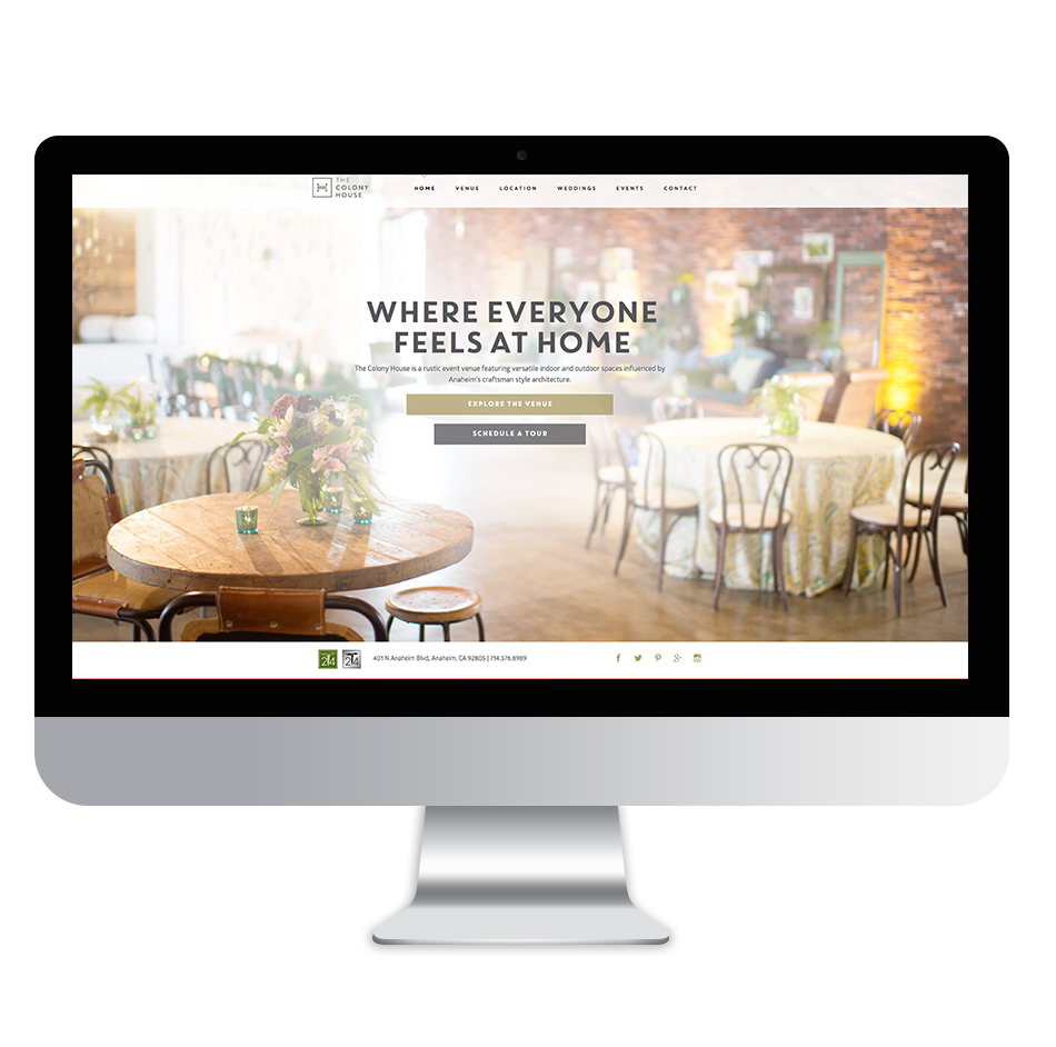
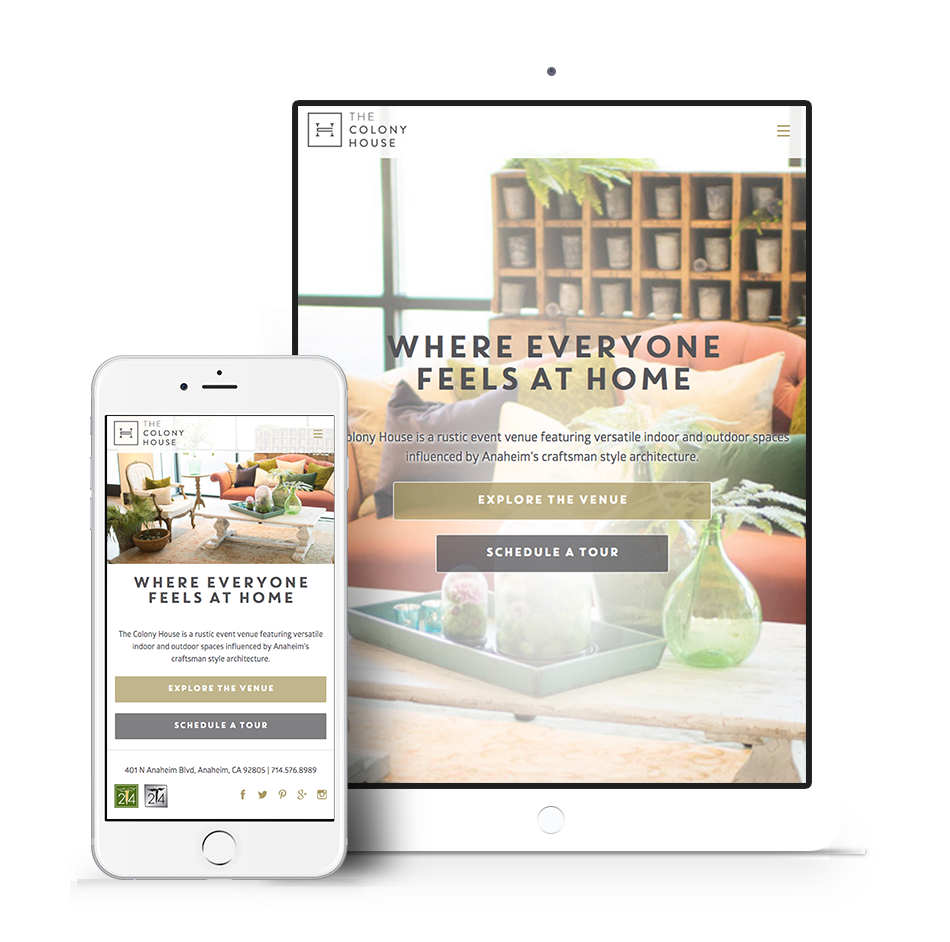
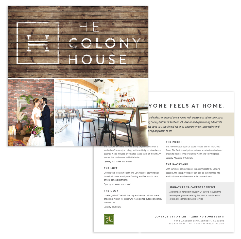
With the identity established, we moved to building a responsive website. It’s a small site with impactful copy and photos, optimized perfectly for mobile phones and larger screens. Print collateral was designed and produced, including business cards, leave-behind brochures, letterhead and more.
What was the result? An influx of new leads for The Colony House, now a wildly popular venue for weddings, social gatherings and corporate events. Another beautiful venue in the 24 Carrots portfolio.
