
Dallien Branding
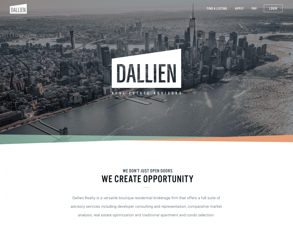
Dallien Realty is a New-York-based boutique residential brokerage firm. As fans of our surf brand Album Surf, they knew we were the right fit when they realized we ran a branding agency. The goal was to not look like other brokerage groups, but bring a fresh, young vibe. One that would attract their 20-something demographic and help them hire and retain internal talent.
Logo Concept Exploration
Album brought several ideas to the table through our logo development process. We steered Dallien to choose a logo concept that was simple but dynamic, then rounded out the identity with a unique color palette and photographic style.
Final Logo
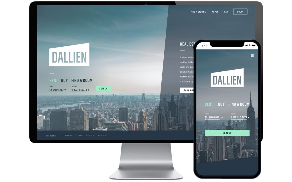
Color Palette and Web Platform

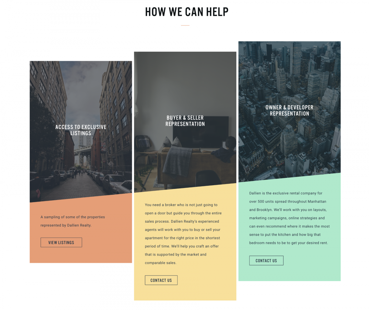
Application Design
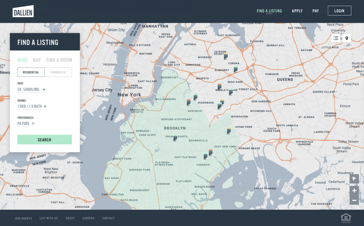
The core part of this branding assignment was to design all the pages for a web-based application that allows users to research available residences in the New York area (and eventually beyond). We focused on a map-based approach with filtering to simplify the result. Each residence detail page holds over a hundred pieces of data that needed to be organized in a simple layout for the user.