How do you refresh the brand of an American classic?
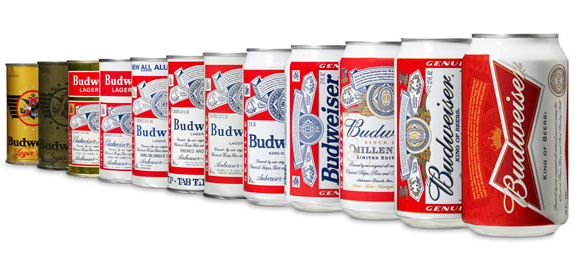
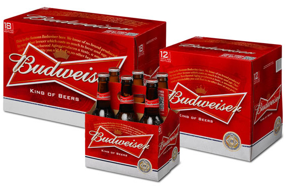
A few weeks ago Budweiser introduced a new icon and packaging design for the first time in a decade. The company hopes emphasizing their “bowtie” symbol will help reverse a trend of declining sales, especially among younger consumers in their 20s and 30s. Most of the blue has been removed from the identity, with red and gold taking a more prominent role. In an effort to maintain the brand’s legacy, traditional elements such as the Budweiser Creed and Anheuser-Busch Medallion still remain.

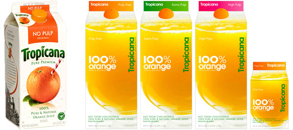
The refresh is certainly bolder and more contemporary than their previous can, which was looking very dated (and not in a cool retro way). The question is whether consumers will resonate with the changes in a way that will result in market share gains. In the past, major redesigns of beverage packaging have been hit and miss. Some are wildly successful, others have no effect at all, and a few actually damage the brand. One famous example of a rebrand that went wrong in this product category is Tropicana. The popular orange juice was totally overhauled in January 2009 only to have PepsiCo (its parent company) revert back to the old packaging within just two months, due to disastrous customer feedback. The problem with the short-lived packaging was that it seemed to throw away all of Tropicana’s brand equity with a bland design you’d expect to see from a generic bargain brand. Consumers could no longer differentiate Tropicana from other orange juices – the exact opposite of what a rebrand should accomplish.
While it’s safe to say Budweiser’s refreshed packaging is in no way a clear disaster along the lines of Tropicana, it will be interesting to see if it affects sales in the next few months.


