Lutava Fitness Brand Launch
Lutava designs forward-thinking fitness products for a forward-moving lifestyle. They approached us to establish their brand positioning and fully define their brand platform, target audience, key messaging and come up with a fitness brand name that would reflect it. We took them through our Brand Tuning process to finalize their positioning in the fitness industry and kickstart the naming process.
Hundreds of prospective brand names were explored with an emphasis on domain availability. The goal was to pick a name that was elegant and feminine, easy to spell and short. We landed on Lutava for all these qualities, including the surprising availability of lutava.com — an elusive gem for naming agencies.
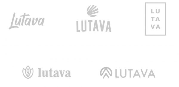
With a name and domain name secured, the logo and identity process began. Our logo exploration was narrowed to the following top 5 concepts.
Logo Concept Exploration
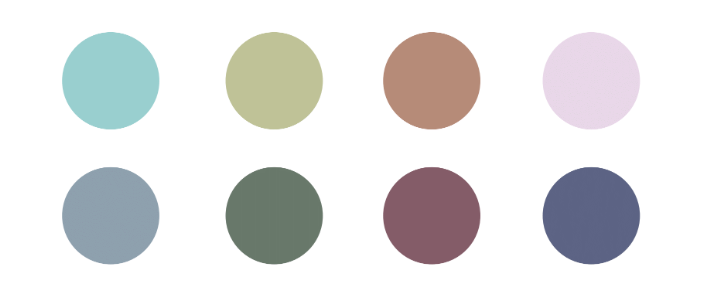
Final Logo and Color Palette
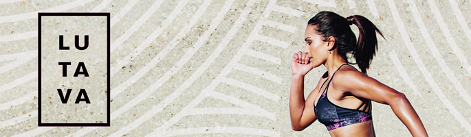
With the intent of reaching a high-end fitness clientele, this logo was chosen. It’s elegant and feminine, but still simple and strong. The use of an outlined box creates a mark of quality that will be imprinted on each of their products, starting with post-workout car seat covers.
The color palette consists of natural, feminine, subdued pastels. There is not one dominant color. The variety of colors paints a story of individual expression and can easily adapt to seasons and trends.
Application
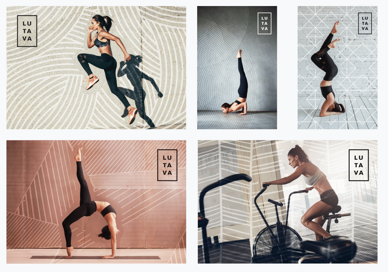
With the logo established, we designed illustrative visual elements that are overlaid on branded fitness photography. This style uniquely emphasizes the importance of motion and precision, while elevating the overall brand identity. These were then applied to social channels and a temporary website.