Pfizer Finesses Their Brand Identity
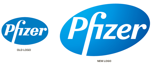
Pfizer, “the world’s largest research-based pharmaceutical company”, recently released a refreshed brand identity. For most people the logo update will go unnoticed, but the overall brand identity (colors, fonts and design style) have been upgraded dramatically. According to Siegel+Gale, the agency behind the design strategy, the new logo “signals positive change and forward momentum and asks people to take a fresh look at Pfizer because it is not the same company it was in 1991” (the last time the logo was refreshed).
The most noticeable difference in the new logo is the oval shape, which was tilted to create a more dynamic arrangement. Subtle changes to every character in the font have resulted in a more rounded, friendlier and soothing feel, with the biggest changes coming to the “z” and the “e”.
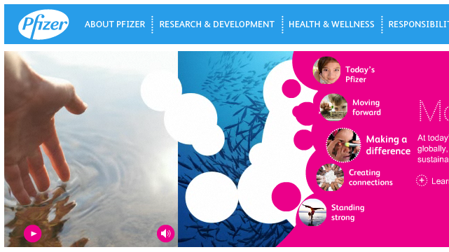
The new color palette is bold and fluorescent and contains a lot of visual energy.
Pfizer’s new identity also carries a strong circular theme, as evidenced in their new home page pictured above. Overall, this is the right move for a global brand that has produced two of the most popular drugs in the world: Lipitor and Viagra. The change positions them as a more progressive and lively brand that is helping to change lives for the better. I applaud them on this strategic step and believe it’s a boost to their brand resonance.


